Thrift
Grocery Savings App
I led brand and product design for Thrift, a grocery coupon app that aggregated deals from multiple retailers. This was a pivot from the existing GroceryPress white-label model, which required custom apps for each retailer. I established the brand identity, designed the mobile app UI/UX, and directed the redesign of the retailer portal to match.
The Problem
GroceryPress was a white-label coupon platform that required building a custom app for each retailer—expensive and unscalable. The UX wasn't great either. The pivot to Thrift meant designing one app where users could browse deals from multiple retailers by location, while also rebranding the retailer portal to match.
The Results
The beta launch saw 30% higher user interaction than GroceryPress. The unified aesthetic between the mobile app and retailer portal was well-received. Although the full launch didn't happen, the strategic foundation and positive beta reception validated the approach.
GroceryPress required heavy customization for each retailer, and the user experience suffered for it. Meanwhile, customers wanted to browse deals from multiple stores in one place—something the white-label model couldn't support.
The pivot to Thrift meant more than a UI refresh—it was a full rebrand and a new product model. I led the transition from white-label to a single, scalable app with its own identity.

The app needed a UI/UX upgrade. Research was done on the existing GroceryPress app, Instacart, and Ibotta. Instacart and Ibotta were referenced in regards to how they were handling the browsing of multiple retailers. Inventory was taken of what worked well and what didn't work well not only for GroceryPress, but as competitive leverage, for Instacart and Ibotta as well.
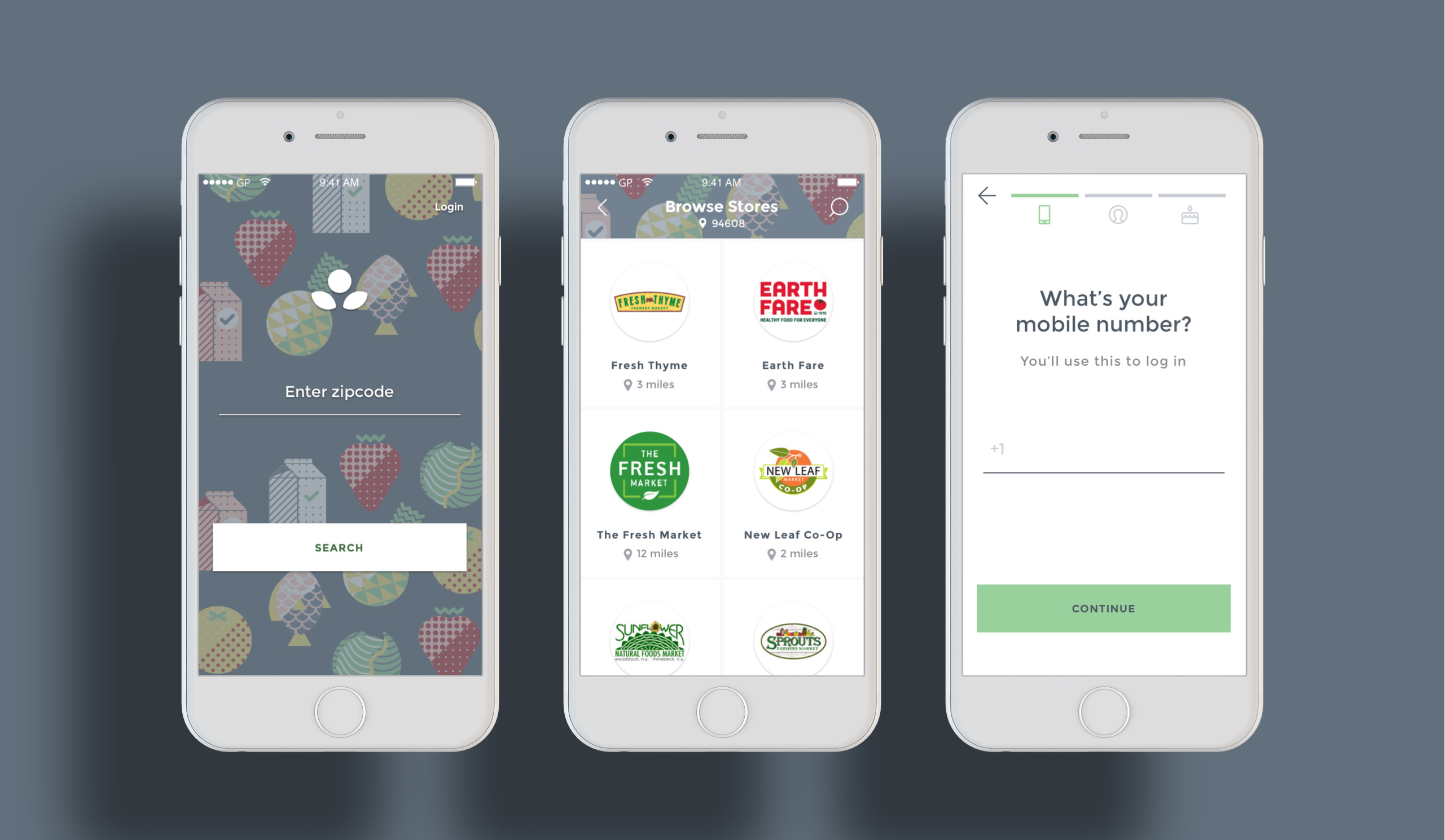

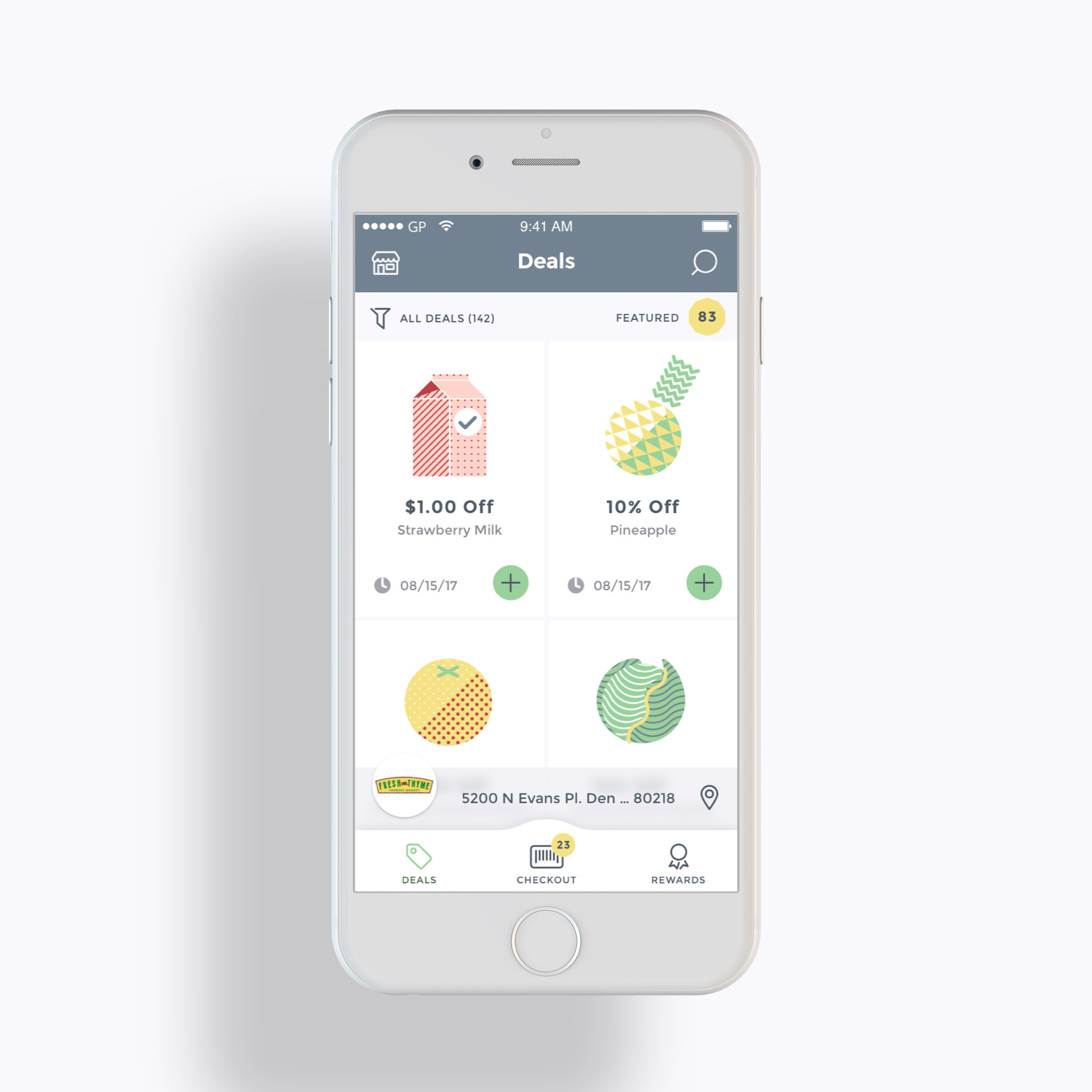
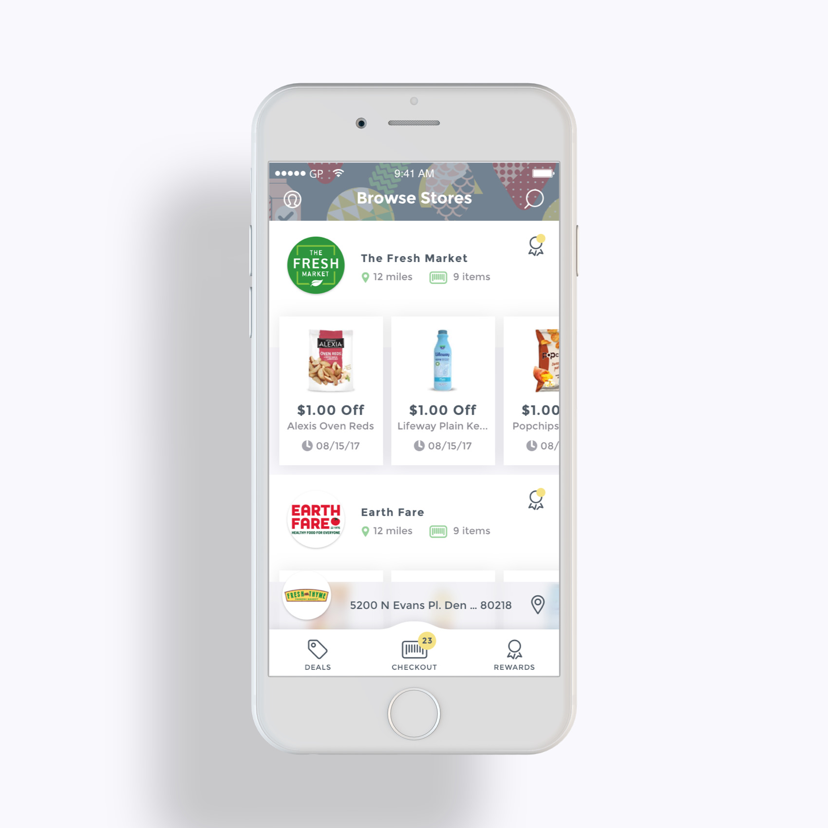
The main difference between the Thrift app and their existing GroceryPress app was that users now had the ability to search deals offered by multiple retailers filtered by proximity to the user's GPS location or user defined zip code. The user had the ability with Thrift to add deals from multiple retailers simultaneously.
The design of the home screen contains a feed of retailer cards each with a set of featured deals that can be added directly from each card. The act of collecting coupons across multiple retailers is lightweight and is accompanied by delightful animations, making the experience easy and engaging. This clarity of content encourages a user to add and redeem more coupons. This also encourages users to try stores in their area they may not have known about or never tried before.


The treatment of the feed in the Thrift app was changed from a list-view to a grid-view. Using a grid of cards instead of list items in the deals feed allows for bigger images and better brand emphasis (a complaint made by retailers in the GroceryPress apps), and adds visual breathability to the design, with breathability being a key design consideration across the app This breathability insures the user isn't overwhelmed with information, increases readability, and emphasizes information hierarchy.


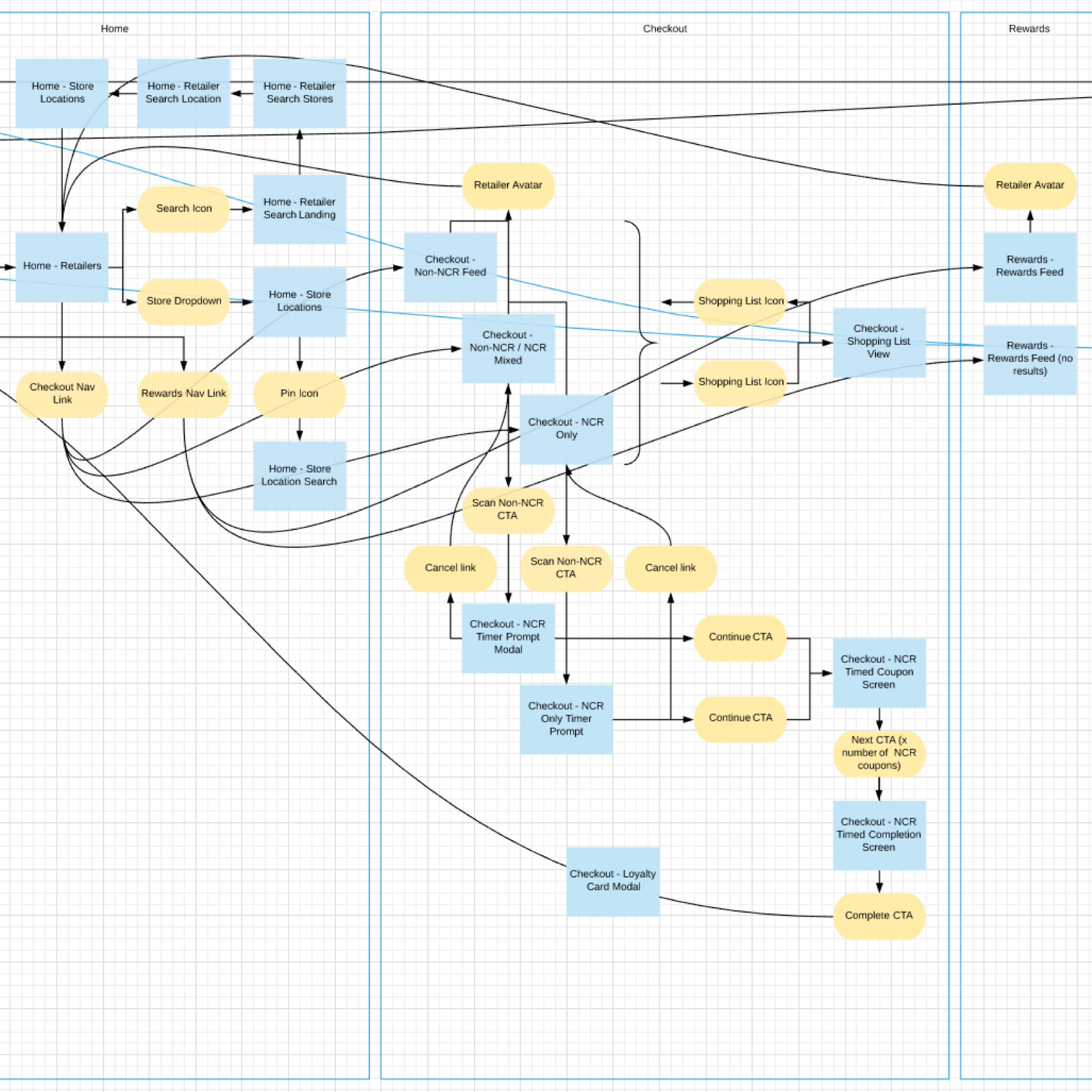
After enough screens were created to start putting them together, I created basic interaction prototypes in Invision which we were also able to import screens into directly from Sketch.
Invision prototypes gave a good high-level idea but lacked a clear map of the interaction logic between certain screens. Using Lucidchart, I created an explicit flowchart labeled one-to-one with the screens in the Invision prototype.
A good amount of work was done toward the Thrift rebranding of the GroceryPress retailer portal. The GP retailer portal was a web app retailers could log into to publish coupons that populated the mobile app. The portal rebrand effort had two main goals in mind, the first was unifying the visual aesthetic between Thrift and the retailer portal, the second was making much needed improvements to the user experience of the retailer portal.
I directed another designer to produce new retailer portal designs pulling from the Thrift app pattern library. I created larger illustration icons based on mobile app icons throughout the portal web app. I provided feedback around new patterns created in the portal designs to guide them along the visual language established in the brand and mobile pattern library.


For the vision of new brand we were leveraging the definition of the word 'thrift' pertaining to growth, longevity, and prosperity. A simple logomark was developed depicting a small sprouting plant representing new growth, consisting of two simple leaves and a flower. The flower was abstracted into a circle to double in metaphor as a coin, suggesting the savings aspect of 'Thrift'. The typeface is a bold serif font to match the weight of the logomark, and is lowercase to evoke a softer, approachable tone appealing to the feminine bias of our brand audience.


Breathability promotes readability and improves information hierarchy throughout the interface of an app. In addition to being functional, this principle is also stylistic, adding a boldness to the overall look and feel via the use of space and size.
This boldness is a key attribute of the brand and carries through from the UI, into the logo, the illustrations and icons, and the typography. Growth, prosperity, and longevity often begin with a new, fresh, open space. This is a big part of why I designed the interface like this, to be spacious.