Symantec Newsroom
Cybersecurity News Platform
I art directed the Symantec Newsroom redesign, working with the lead strategist to rethink the information architecture and establish a new visual style. The existing newsroom was over a decade old—just a text-heavy list of links with no mobile support or social sharing. I developed a tile-based responsive layout that incorporated Symantec's pixel brand motif throughout, directed a team of designers on wireframes and interior pages, and presented multiple directions to stakeholders.
The Problem
Symantec's newsroom was a decade-old, three-column list of text links—no images, no mobile support, no social sharing. It didn't reflect the brand at all. They needed a complete redesign that would incorporate their current branding, make content easier to browse, and work on any device.
The Results
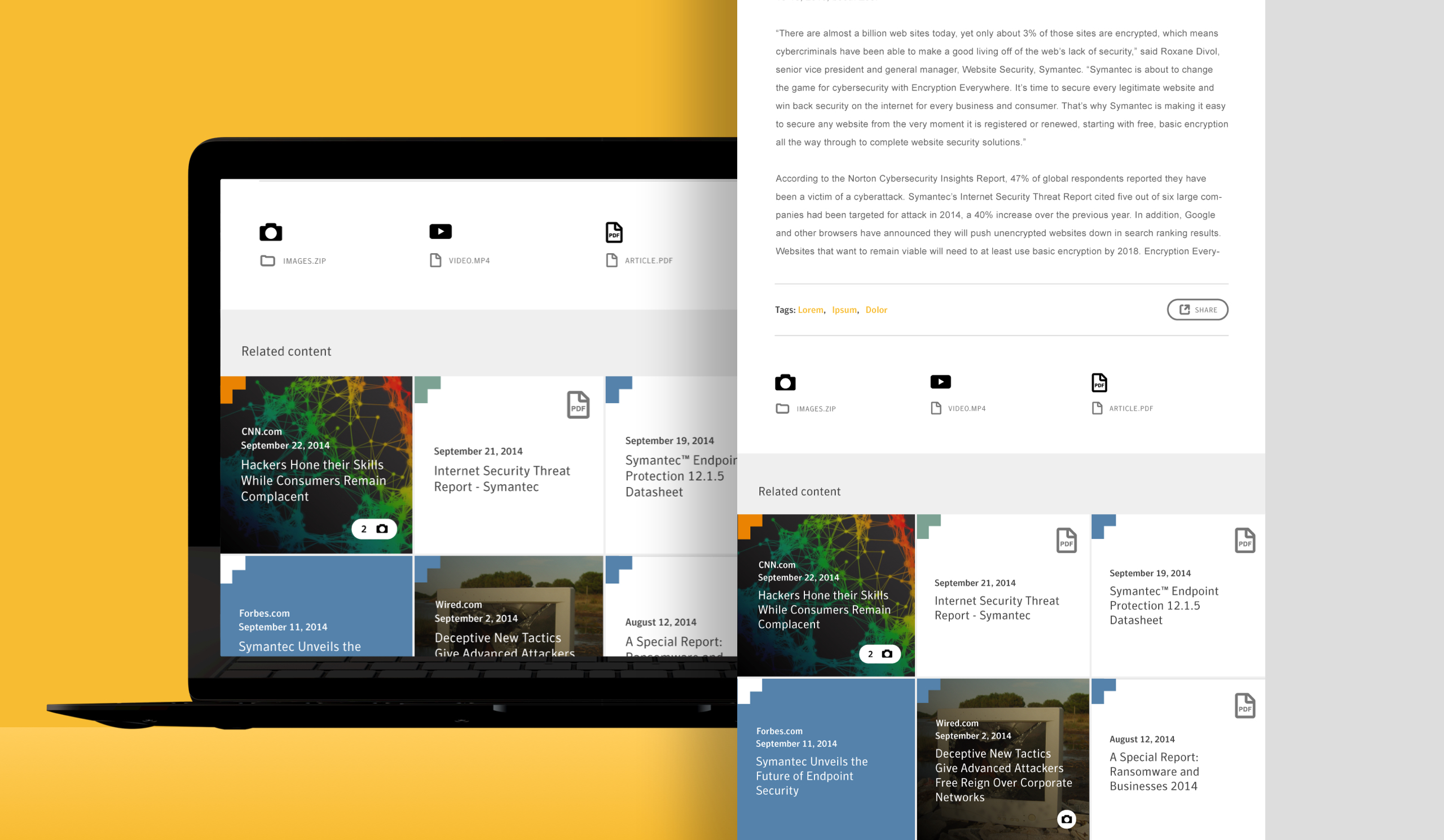
The redesign increased user engagement by 40% and average site duration by 30%. Article shares jumped 70% with the new social functionality. The tile-based masonry layout, built on a consistent four-column grid, gave the site a distinct look while making content easier to scan and filter by category.
Symantec's newsroom didn't match their position in the market—it looked dated and lacked basic functionality. The project meant rethinking both the visual design and the information architecture to make content easier to find and share.
I worked with the lead strategist and directed a team of designers on a responsive redesign that served multiple audiences—internal stakeholders, journalists, and the public. The design needed to work across content types and devices while feeling distinctly Symantec.
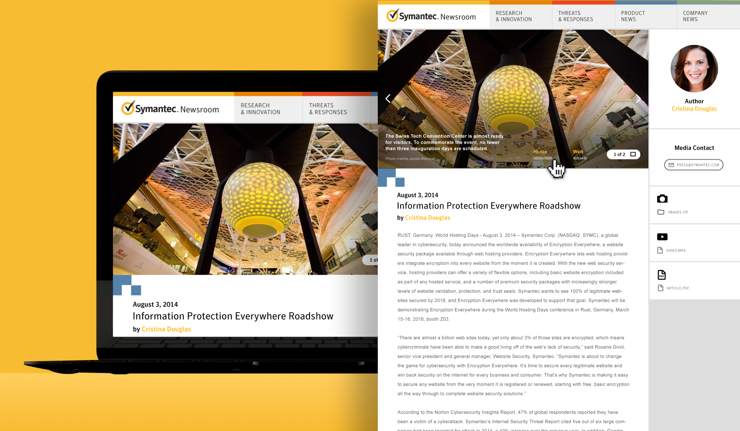
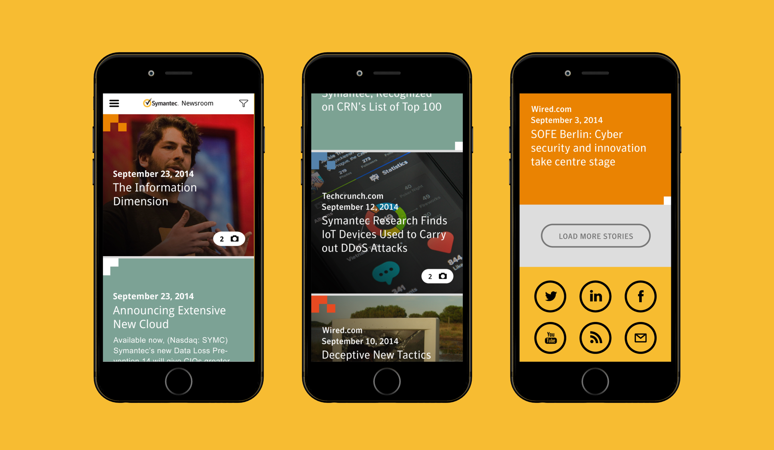
I worked with the lead strategist who was working with other key stakeholders to nail down what content we wanted to show and roughly where. I went through their existing newsroom and got a feel for the kind of content it was comprised of, identifying if it had images or not, etc., in order to start thinking of ways to present the content.
Starting with the homepage wireframes from the IA, I did 3 variations on aesthetics, content organization, and interaction. In each, I stripped the text down to headlines and brought images into content modules. For articles without images, I used a solid color as the bg, taken from the styleguide color palette and corresponding to the category the article was under. All modules, image or not, had a category color treatment. I integrated brand elements throughout, which served visually as well as functionally. I presented these variations to stakeholders.
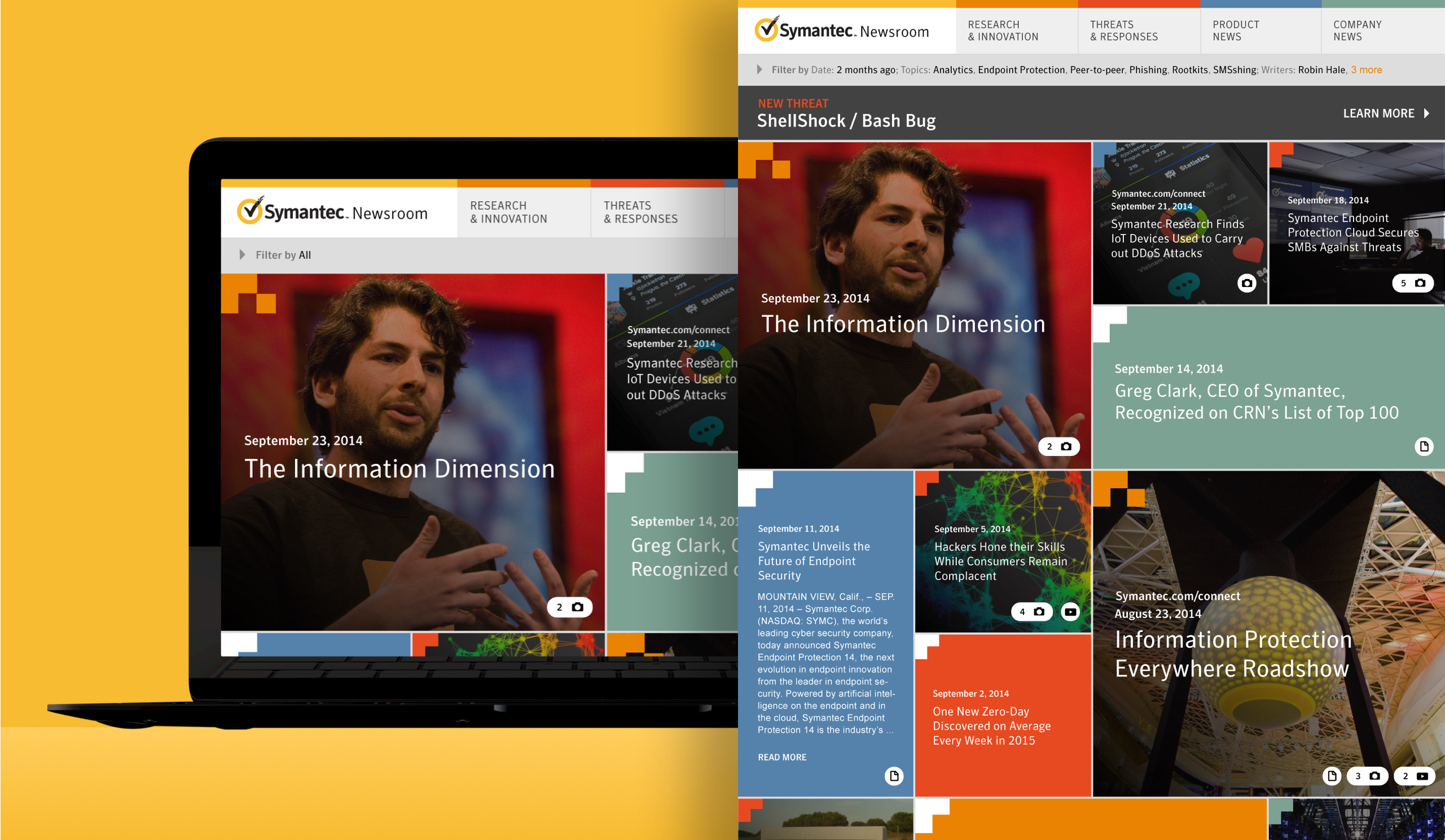

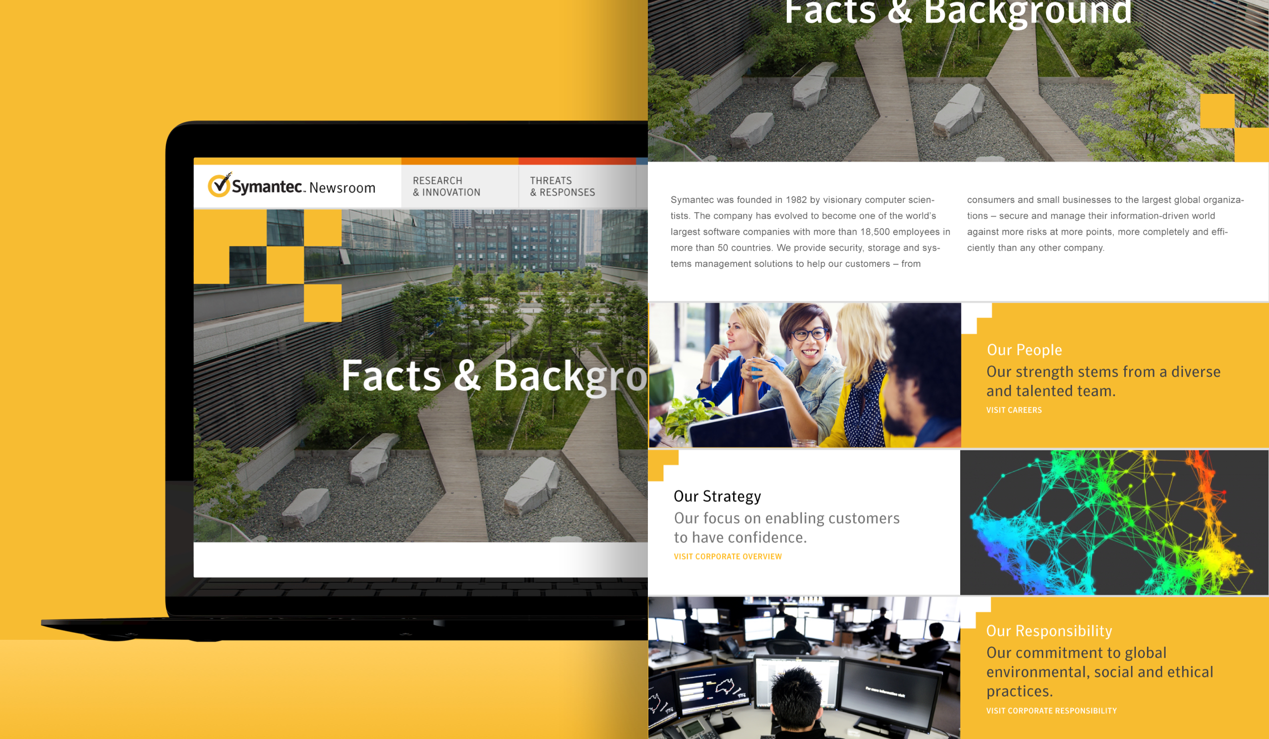
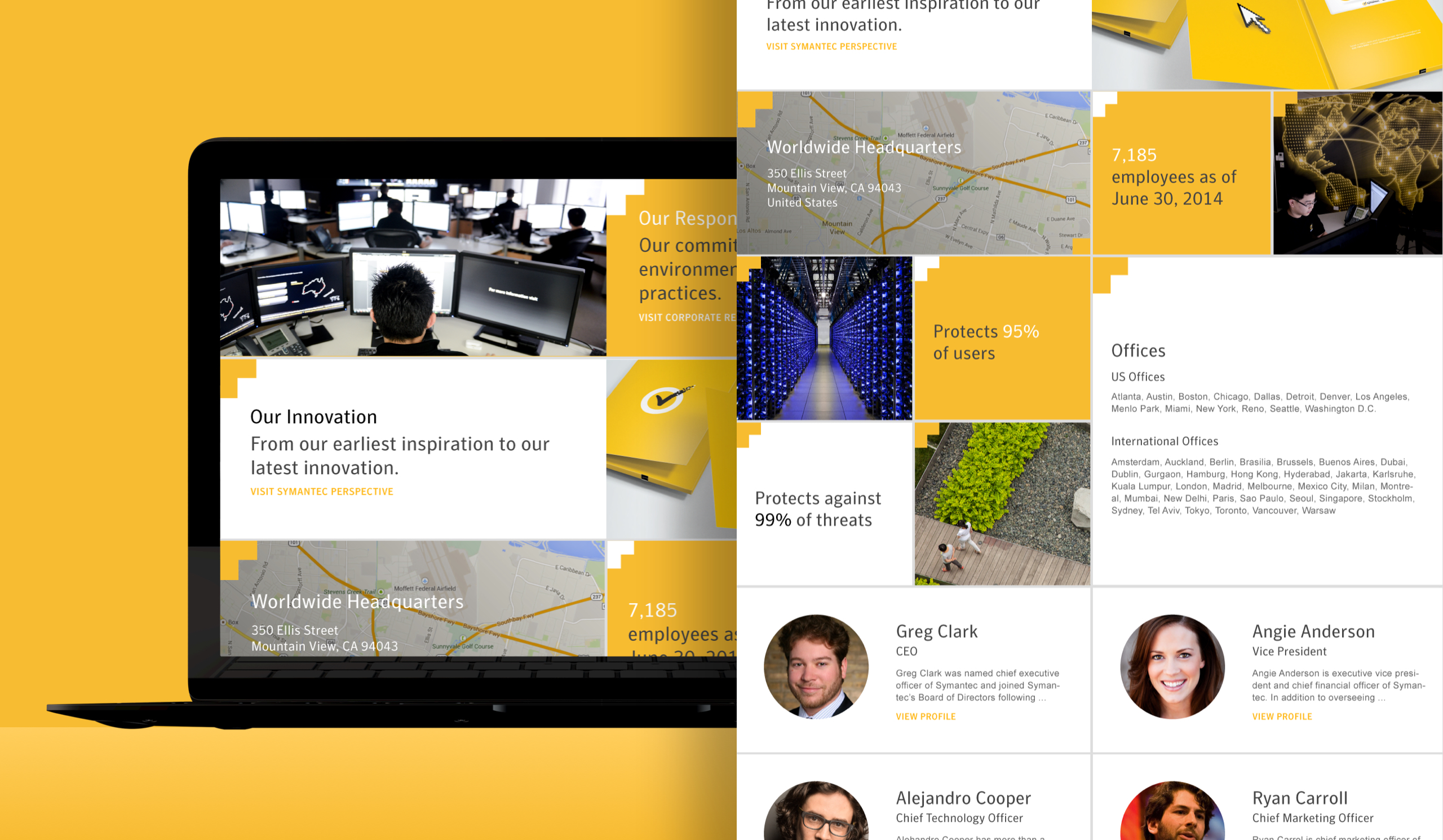
In the chosen direction, UI elements would be broken into responsive tiles. The first consideration was branding. The primary motif in the Symantec branding materials was a randomized cascade of yellow 'pixels'. This motif was taken from the pixelating checkmark of their logo mark. This motif was incorporated onto feed tiles to color-code them per category. The home page would be a feed pulling from all categories, and the links in the top nav would be for each one, effectively acting as a filter. The tile layout for all of the elements echoed the yellow pixel brand motif, saturating the updated newsroom with their newer brand. This would also give the site break-articulation and, with a masonry layout, add heirarchy to the articles. Extending the tiled style throughout, even to non-feed pages like about, would give the site a strong consistent visual language and a bold distinct look.
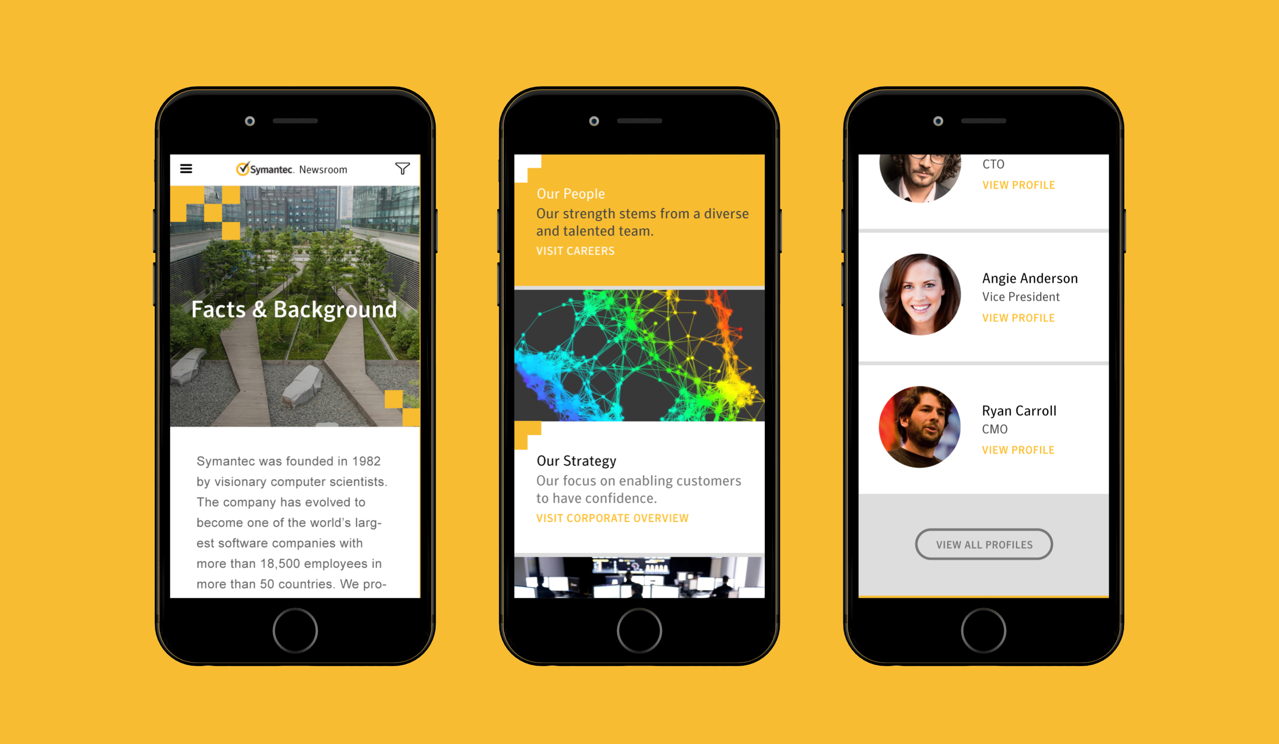
I applied the masonry-style layout to the article (interior) pages. I used the same four column grid across every page template design for consistency, responsiveness, and style. The brand element I chose represented pixels, data, information, so I wanted to use a pronounced grid to incorporate the brand into the user experience. I made sure a fully branded experience would scale well across categories, different kinds of content, on different devices, and anticipate pages to come.